How to Choose the Perfect Paint Color for Every Room
Choosing the right paint color for a room is more than just picking a favorite shade from a swatch; it’s a deliberate decision that can transform the mood, perception of space, and overall aesthetic of your home. With countless color options available today, homeowners often find themselves overwhelmed by the choices, unsure of how a particular hue will look once applied. The impact of paint extends beyond beauty—it affects comfort, lighting, and even emotional wellbeing. A well-chosen color can make a small room feel expansive, a dark space feel welcoming, and an ordinary room feel extraordinary. Understanding how to select paint wisely is an essential step in achieving a harmonious, inviting, and visually appealing home environment.
Moreover, the process of selecting paint color involves more than instinct or trend-following; it requires a thoughtful approach that considers room function, natural light, existing furnishings, and personal style. Interior designers and color experts emphasize that colors evoke emotions and influence human behavior, making the choice a critical design decision. This guide will provide actionable strategies, practical tips, and expert insights to help homeowners confidently select the perfect paint color for every room in their home, ensuring both aesthetic appeal and functional harmony.
1. Understanding Color Psychology
The Emotional Impact of Color
Colors have a profound influence on human emotions and behavior. Warm colors such as reds, oranges, and yellows can energize and stimulate conversation, making them ideal for living rooms and kitchens. In contrast, cool colors like blues, greens, and purples create a calming and relaxing atmosphere, often preferred in bedrooms and bathrooms. Understanding how each color affects mood allows homeowners to align paint choices with the desired emotional effect for each space.
Room Function and Color Selection
Before selecting a paint color, consider the purpose of the room. A vibrant red may boost energy in a home gym but could be overwhelming in a study or bedroom. Neutral shades such as beige, gray, or taupe offer versatility and balance, making them suitable for multi-functional areas. By evaluating the room’s function first, homeowners can narrow down their choices to colors that enhance the intended atmosphere.
Real-World Example
For example, a parent might choose soft lavender for a nursery to create a tranquil environment conducive to rest, while choosing an inviting yellow in a kitchen to encourage a cheerful and lively space for family gatherings. Consulting color psychology charts and experimenting with sample swatches can provide valuable guidance before committing to a final color.
2. Assessing Lighting Conditions
Natural vs. Artificial Light
Lighting significantly influences how a paint color appears. Natural light changes throughout the day, affecting the tone and warmth of the color. North-facing rooms may appear cooler and darker, while south-facing spaces are bright and warm. Artificial lighting, including incandescent, fluorescent, or LED lights, can also alter perception, making colors appear warmer or cooler than intended.
Conducting a Lighting Test
To accurately assess a color’s impact, paint a small sample on different walls and observe it at various times of day. This testing ensures that the chosen color looks consistent under changing lighting conditions. Interior designers recommend evaluating colors under natural morning light, mid-day brightness, and evening artificial light to anticipate any unexpected shifts.
Best Practices
Using light-reflecting paints in darker rooms can enhance brightness, while matte finishes can reduce glare in brightly lit areas. Understanding the interaction between light and color allows homeowners to create balanced spaces that feel comfortable and visually appealing at any hour.
3. Complementing Existing Furnishings and Decor
Harmonizing with Furniture
Paint should complement, not clash with, existing furniture, flooring, and decor. Homeowners can create cohesion by selecting colors that echo the hues of upholstery, rugs, or artwork. For instance, a room with warm wooden floors may pair beautifully with muted earth tones, while a room with sleek modern furniture might benefit from cooler grays or soft pastels.
Considering Style and Texture
Beyond color, texture and style influence paint selection. Glossy finishes highlight architectural details but may exaggerate imperfections, while matte or eggshell finishes provide subtle elegance and hide flaws. The overall style of the home—whether traditional, contemporary, or eclectic—should guide the palette choice, ensuring a cohesive design that feels intentional.
Actionable Tip
Create a mood board with fabric swatches, furniture pieces, and paint samples. This visual tool helps homeowners see how colors interact in the context of their room, reducing the likelihood of mismatched or unsuitable choices.
4. Testing and Sampling Paint
The Importance of Sample Swatches
Even with careful planning, colors often appear differently on walls than on swatches or digital screens. Sampling paint is an essential step to ensure the color meets expectations. Apply samples to multiple walls in various lighting conditions, then live with them for several days to evaluate the emotional and visual impact.
Techniques for Effective Testing
Use large poster boards or test patches directly on the wall for a more accurate representation. Viewing the color at different times—morning, afternoon, and evening—provides a realistic perspective. Additionally, testing multiple shades from the same color family allows homeowners to compare subtle differences and select the perfect tone.
Overcoming Common Challenges
One common challenge is underestimating undertones, which can shift a color toward yellow, pink, or gray. Sample testing reveals these undertones, helping homeowners avoid unexpected outcomes. Working with a professional color consultant or designer can provide additional insights and expert recommendations.
5. Leveraging Color Trends vs. Timeless Choices
Navigating Current Trends
Modern design trends often highlight bold, dramatic hues or unique accent colors. Incorporating trending shades can create a fresh, contemporary look, but trends evolve quickly. For homeowners seeking a temporary update, an accent wall or furniture pieces in trendy colors can provide vibrancy without overwhelming the room.
Prioritizing Timelessness
Neutral and classic colors offer longevity and versatility, ensuring the room remains stylish for years. Shades such as soft whites, muted grays, and warm taupes provide a neutral backdrop that complements furniture updates, artwork, and seasonal decor changes. Combining timeless neutrals with carefully chosen accent colors balances style with durability.
Expert Insight
Design professionals often recommend selecting a primary neutral for large areas and integrating trend-forward colors through accessories, accent walls, or trim. This approach allows homeowners to enjoy contemporary flair while maintaining a cohesive, timeless interior.
6. Balancing Bold and Subtle Colors
When to Choose Bold Hues
Bold colors create statement spaces and convey personality. Dark blues, emerald greens, or rich burgundies can add drama and sophistication when used thoughtfully. Rooms with ample natural light or larger dimensions are particularly suitable for deeper shades, which might otherwise feel oppressive in smaller, darker rooms.
Subtle Shades for Everyday Comfort
Subtle, muted colors foster a sense of calm and are ideal for bedrooms, home offices, or meditation spaces. Soft pastels, light grays, and beige tones enhance tranquility while allowing furniture and decor to stand out. These shades often appeal to potential homebuyers, increasing the resale value of a property.
Practical Application
Consider dividing the palette by room function and desired ambiance. For example, a bright kitchen can handle an energetic yellow accent wall, while adjoining spaces use soft neutrals to maintain flow. Striking the right balance between bold and subtle ensures a harmonious home environment that feels both lively and comfortable.
7. Understanding Undertones and Color Harmony
Identifying Undertones
Colors often contain underlying hues that influence their appearance. A beige may lean pink, green, or gray depending on its undertone. Recognizing these nuances is essential to achieve color harmony and prevent clashes with furnishings, flooring, or adjoining walls.
Creating a Cohesive Palette
When designing an entire home or multiple rooms, maintaining color harmony is crucial. Select complementary colors or shades within the same undertone family to create a smooth transition between rooms. For example, a soft taupe in the living room can flow seamlessly into a muted olive in the dining area.
Real-World Benefit
Understanding undertones also assists in coordinating accent pieces, fabrics, and artwork. A cohesive color scheme enhances the perception of space, making homes feel thoughtfully designed and visually comfortable.
Bringing Style and Function Together Seamlessly
Selecting the perfect paint color requires thoughtful planning, consideration of lighting, room function, existing decor, and personal taste. By understanding color psychology, testing samples, and balancing bold and neutral shades, homeowners can create spaces that reflect their style, enhance comfort, and elevate the overall ambiance. Careful attention to undertones, lighting conditions, and color harmony ensures cohesive, visually appealing interiors that stand the test of time. Employing expert strategies and real-world testing minimizes the risk of disappointing results, giving homeowners confidence in their choices.
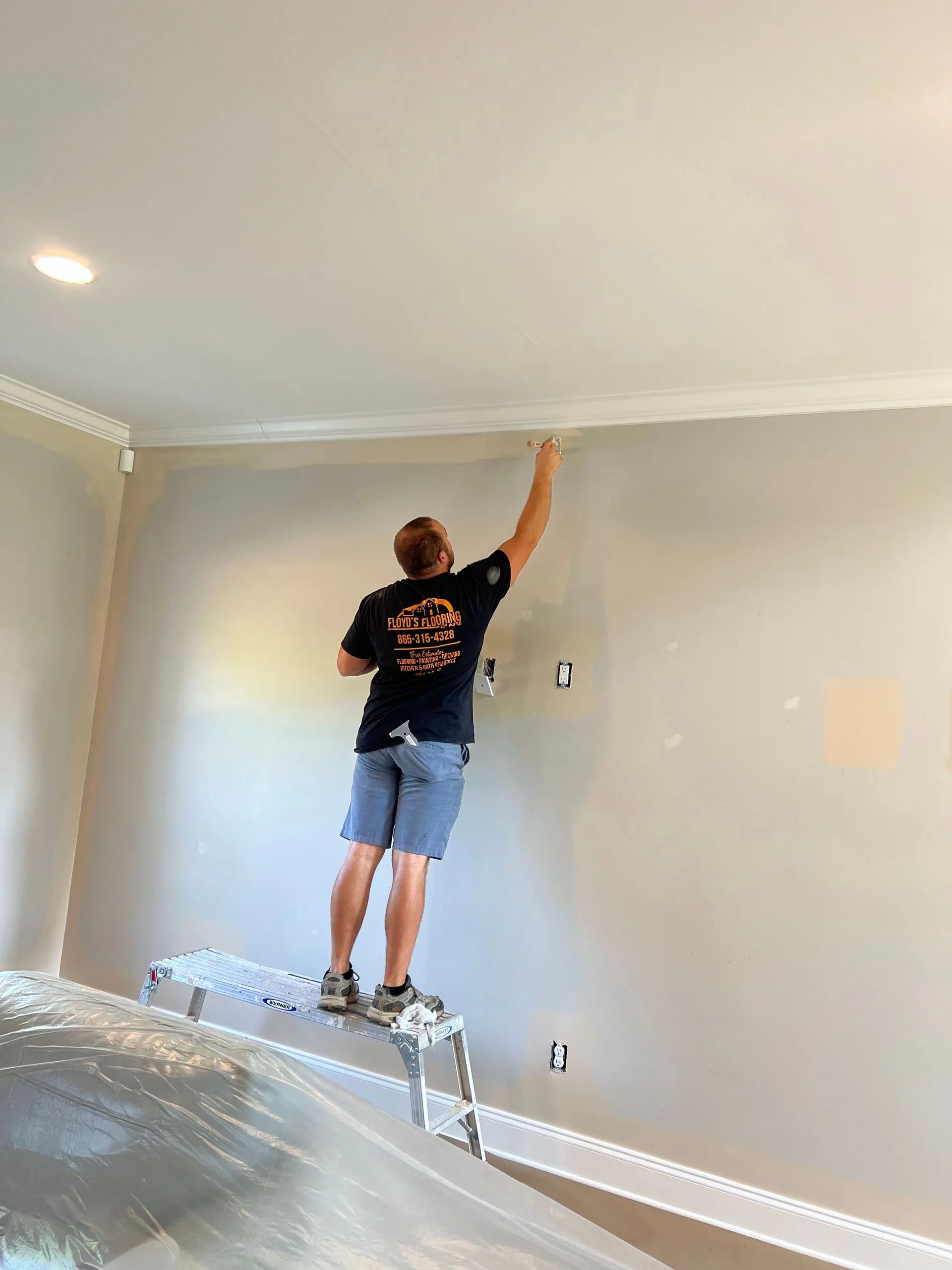
At Floyd's Flooring & More, LLC, located in Seymour, Tennessee, we combine 10
years of experience with a commitment to quality and customer satisfaction. Our team of experts understands the transformative power of color and how it interacts with flooring, furnishings, and lighting. From selecting paint to creating complementary designs, we provide personalized guidance and professional services that ensure every room achieves its full potential. Trust Floyd's Flooring & More, LLC
to help bring your vision to life with precision, expertise, and care.